Google Changed their Design
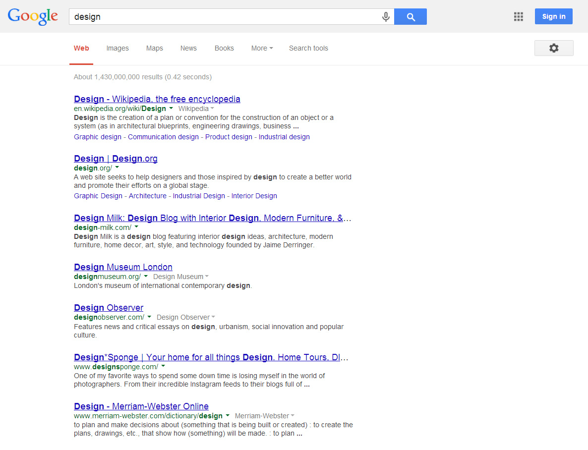
I have just noticed a small, but still noticeable design change of Google search result page.
Here’s how it looked before:
And here’s the new design. It was changed on the 10th of March 2014.
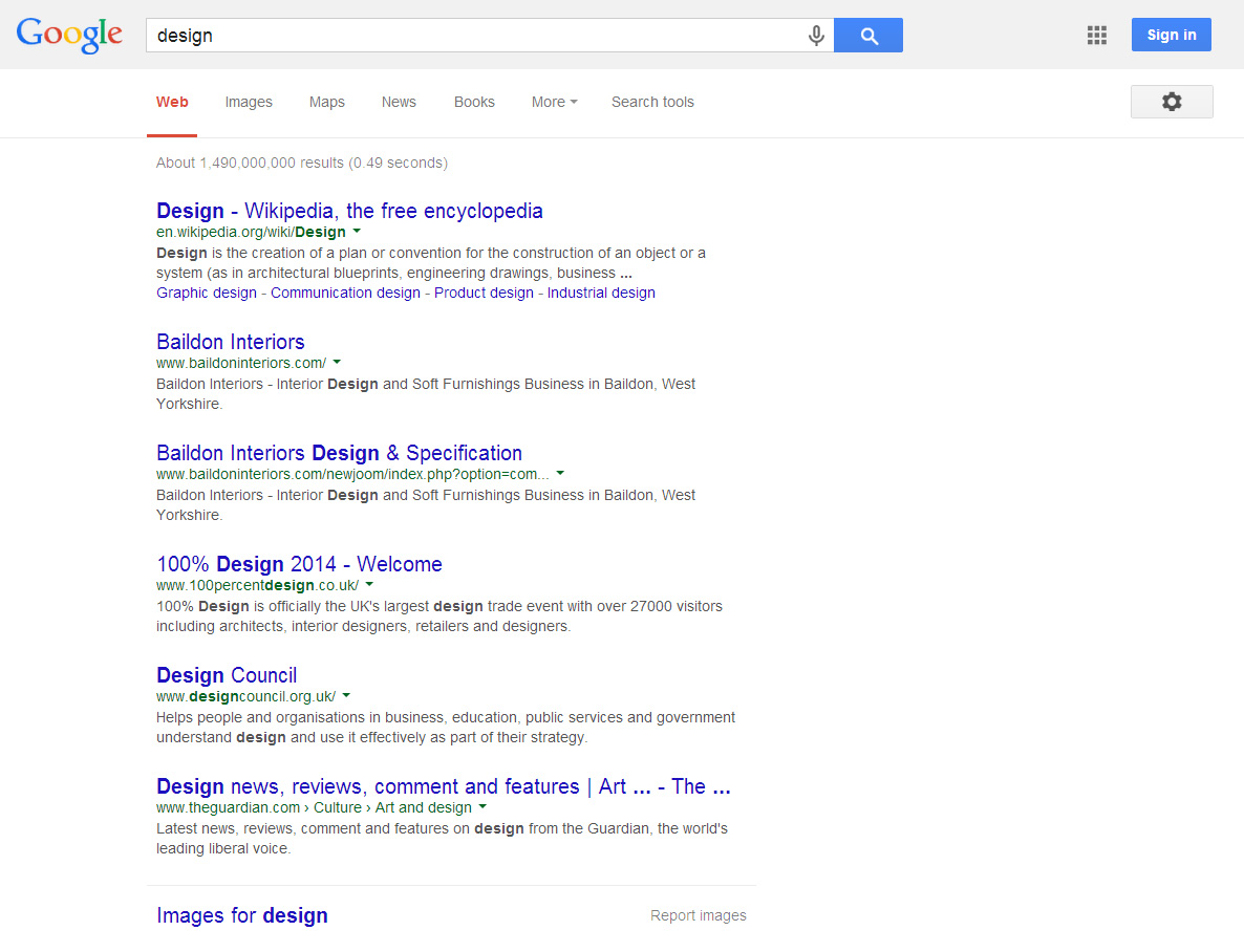
The main text colour (grey) has become a little bit lighter, the line spacing has increased, the font size of the green text has decreased and of course, the most noticeable change is the blue link underline: it’s gone. Also, the font size of the blue headings has increased.